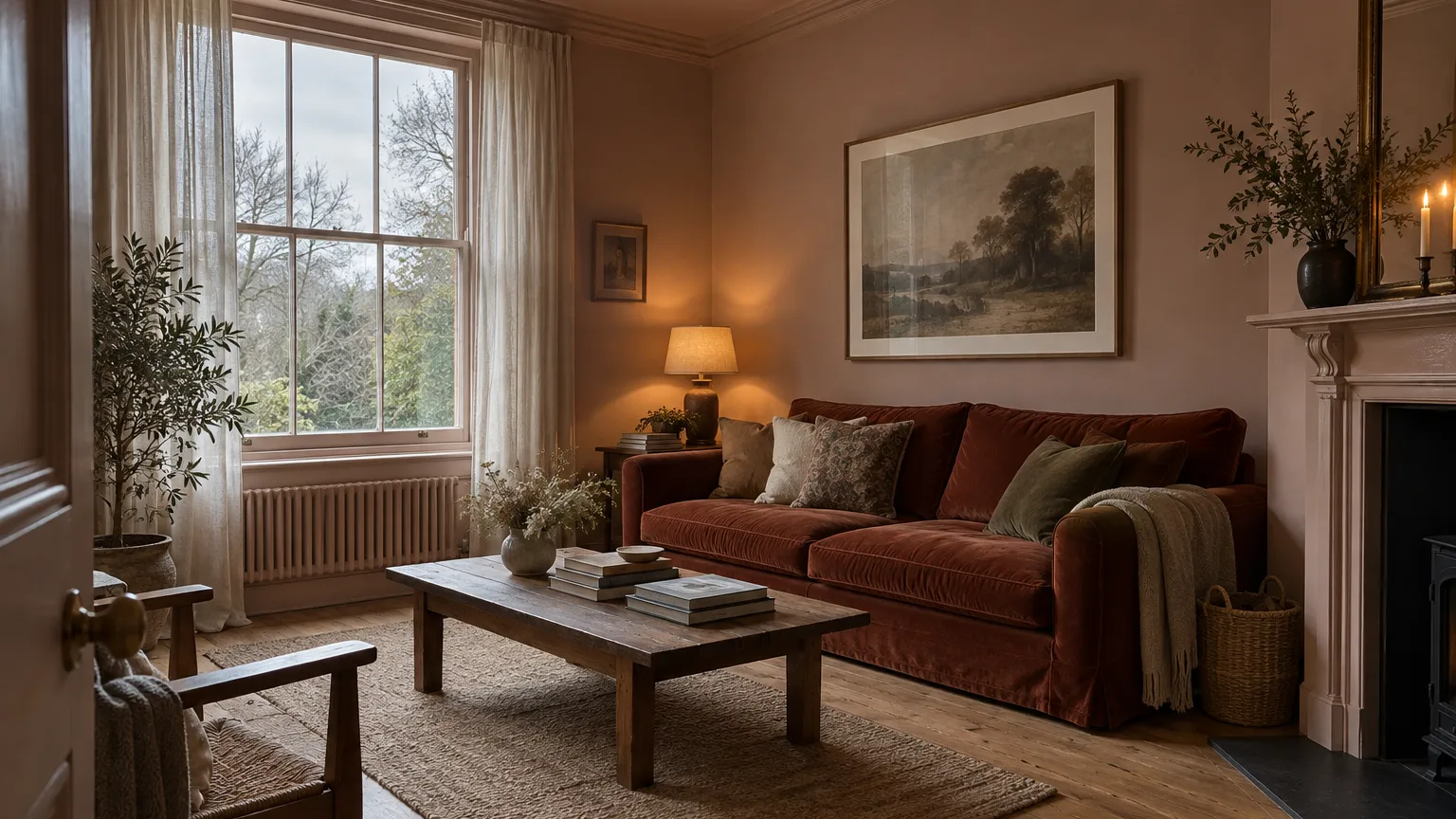
Three o'clock on a November afternoon, and the living room already needs a lamp on. The grey that looked soft and calm on the colour card now looks like a wet pavement, and the white ceiling has gone the colour of a filing cabinet.
That is north light doing what it always does. The fix is not a paler paint. It is a warmer one — a colour with yellow, red or brown in its base. Or, if you would rather the room felt enveloping than airy, a deep warm colour that the steady light makes look rich.
What north light actually does
In the northern hemisphere, a north-facing window never gets direct sun. Everything that comes through it is light from the sky, which is bluer than sunlight and arrives from no particular direction.
Three things follow:
- Colours shift cool. Anything with blue, green or violet in its base leans further that way. A neutral grey becomes a blue-grey; a soft white becomes a grey one.
- Colours lose depth. Without sun patches and hard shadows there is less contrast in the room, so walls read flatter and a step darker than the chip.
- The light barely changes. A south-facing room swings from bright noon to orange evening. A north-facing one looks almost the same at ten and at four. That sounds like a drawback, and it is also the reason deep colours work so well here.
The same physics is behind the advice in north or south facing changes your exterior colour. Indoors it is stronger, because the window is the only light there is.
Swap the colours that go grey
Most north-facing rooms that feel cold are painted in one of five colours that work perfectly well somewhere else. Each has a warmer relative that survives the light.
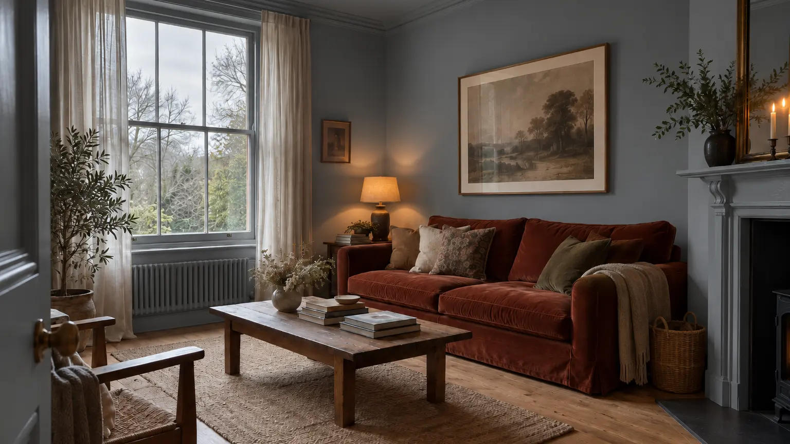
The same room and the same overcast light as the photo at the top, painted a cool mid grey.
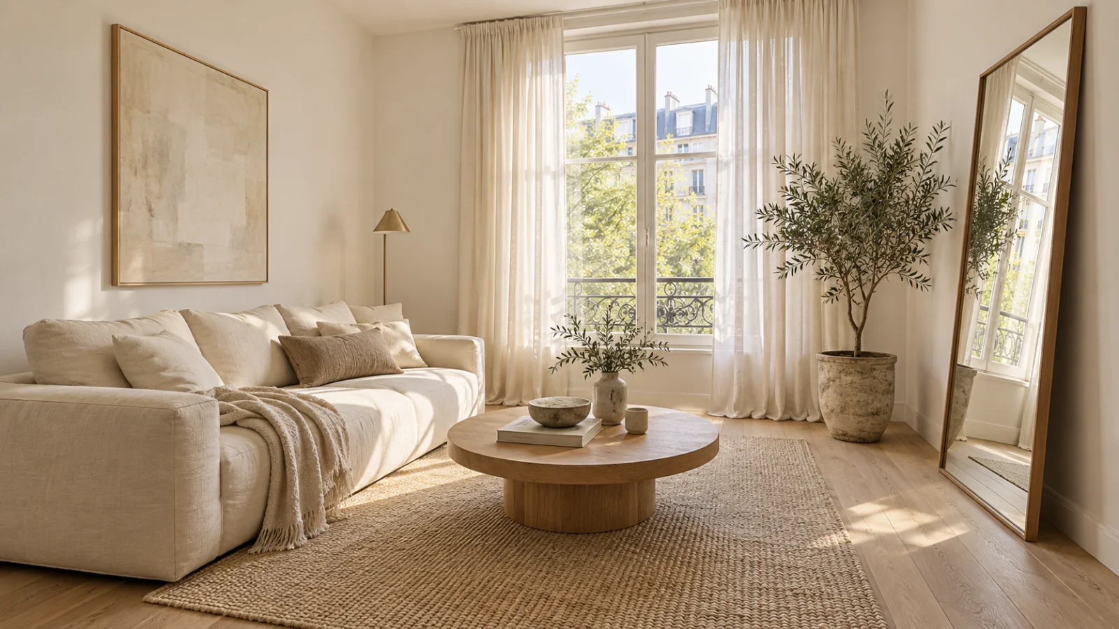
Instead of brilliant white → a warm white with a yellow or red base. Brilliant white needs sun to look white; in north light it goes grey and faintly blue. A creamier white looks brighter here, even though its light reflectance value is lower on paper. Try Farrow & Ball Pointing (No. 2003) or Benjamin Moore Swiss Coffee (OC-45).
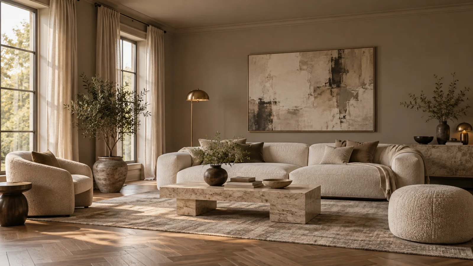
Instead of a cool mid grey → warm stone. The grey that was meant to be neutral turns blue and flat, as in the picture above. A stone or greige with a red-yellow base stays neutral instead of going cold. Try Farrow & Ball Stony Ground (No. 211) or Benjamin Moore Edgecomb Gray (HC-173).
Instead of pale blue → a green with yellow in it. Duck-egg and powder blue go icy without sun. If you want something cool and fresh, move along the colour wheel to a green that leans yellow rather than blue. Try Farrow & Ball Vert de Terre (No. 234) or Benjamin Moore Saybrook Sage (HC-114).
Instead of a lilac-grey → plaster pink. Some greiges hide a little violet that stays invisible on the card and comes out in north light as a dull mauve. A muted pink with brown in it does the opposite: it reads as warm bare plaster all day. Try Farrow & Ball Setting Plaster (No. 231) or Pink Ground (No. 202).
Instead of charcoal or navy → olive or chocolate. Cool darks in cool light can make a room feel like a cellar. Warm darks — a deep olive, a brown with red in it — make it feel like a library instead. Try Farrow & Ball Bancha (No. 298), Benjamin Moore Tarrytown Green (HC-134) or Farrow & Ball London Clay (No. 244).
The pattern behind all five: keep the colour you wanted, and choose the version of it with warmth in the base.
Or stop chasing light and go deep
The usual advice is to keep dark colours in a north-facing room to an accent wall. That is advice for rooms where daylight is the point. In a study, a bedroom, a dining room or a snug — rooms used mostly in the evening anyway — the steady north light works in your favour. A deep colour that would swing between glowing and murky in a south-facing room stays the same rich colour from morning to dusk.
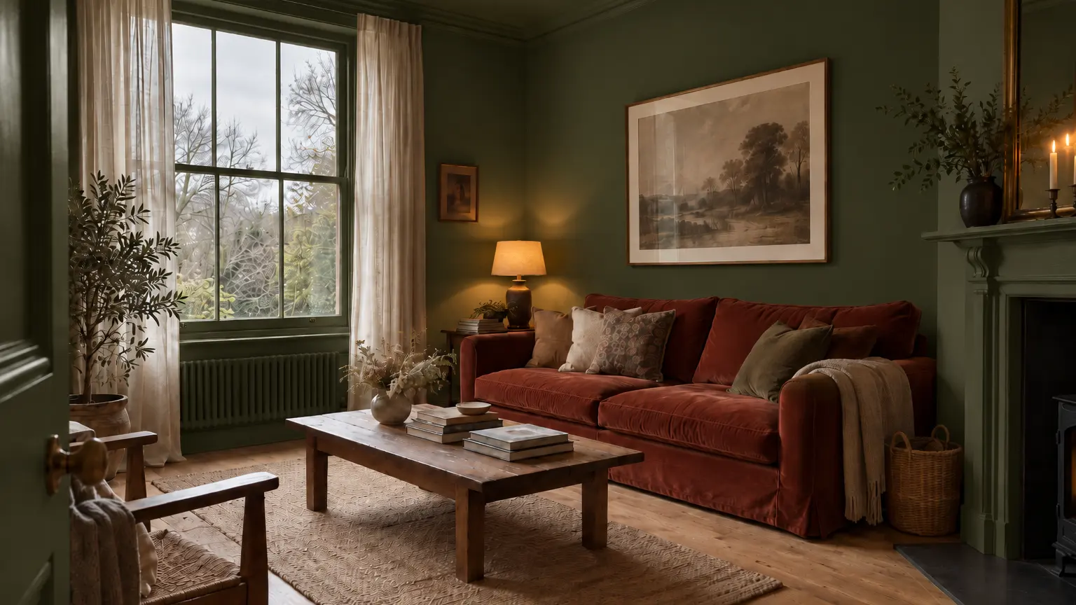
The same room again, with walls, ceiling and woodwork in a deep olive.
Two conditions. Take the colour onto the woodwork, and ideally the ceiling, so the room has fewer lines and reads as one deliberate colour rather than a dark box with white edges. And pick a warm dark from the last swap above, not a cool one.
Half the year, it is lamplight
From October to March a north-facing room is seen under bulbs more than under daylight, and the bulb changes the colour as much as the window does.
- Warm white bulbs, around 2700K, add the yellow the window is missing. Most of the warm colours above look their best under them.
- Cool white and daylight bulbs, 4000K and up, add more blue to a room that already has too much. They can make a warm grey look like a cool one.
- Check the bulb before you blame the paint. If the room only looks wrong in the evening, new bulbs cost less than repainting.
So look at samples after dark too, under the lamps you actually use, not only at midday.
Test it on a grey afternoon
Choose in the worst light the room gets: an overcast afternoon in late autumn, and the same room at night with the lamps on. A colour that holds up in both will be fine in May.
Take two photos of the room, one in each of those lights, and try the swaps on both. The colour that still looks warm in the grey afternoon photo is the one worth a sample pot.
Stop imagining it. Look at it.
One photo of your house, and Exterior Snap AI shows you the finished result in about ten seconds.