Some rooms look expensive before you notice a single piece of furniture. It is rarely the price of the paint. It is the colour itself, how far the colour goes, and the finish it is in.
The five colours that do it most reliably are warm white, greige, sage green, mushroom taupe and deep navy. What they share matters more than the list: all five are muted, all five look best matt, and all five work better when the woodwork goes with them instead of against them.
Muted colours look like a material
Clean, bright colours look like paint. Muted colours, with a little grey, brown or black in the mix, look like a material — plaster, stone, linen. That is why the colours that read as high-end are the dusty ones: greige rather than beige, sage rather than green, navy rather than blue, mushroom rather than brown.
A useful test: if a child could name the colour in one word, it will probably read cheap across four walls. If you need two words to describe it, it is probably the right one.
Fewer lines
Every change of colour draws a line, and a room full of lines looks busy. Brilliant white skirting, frames and ceiling around a coloured wall draw the most lines of all.
The expensive version keeps only the lines the architecture has earned. Panelling, a picture rail or a deep cornice can take a contrast, because there is something there to frame. Plain skirting boards and door frames on a flat wall cannot. Paint them in the wall colour, or one shade off it, in a harder-wearing sheen.
Take that all the way, onto the ceiling and the doors, and it becomes colour drenching — the same trick that makes a small room look bigger. In a larger room it does something else: it makes the space look designed rather than decorated.
The finish matters as much as the colour
Shiny walls look cheap. They show every roller mark, dent and patch of filler. A matt or flat finish absorbs light softly and makes a colour look deeper and richer; most brands now make a washable matt that copes with hallways and kitchens.
Keep the sheen for the woodwork, in the same colour as the walls. For more texture, limewash and clay paints add a soft cloudy movement that reads as handmade.
Skip stark white and landlord grey
Brilliant white and cool mid-grey are the default colours of rentals and new builds, and the eye recognises them as default. A warm white with a drop of yellow or red, or a soft greige, gives the same lightness without the builder-grade feel.
Let the room choose the colour
Paint is the backdrop for the things that actually cost money: the floor, the stone, the metal, the fabric. Choose the wall colour against them, not on its own.
When a room looks slightly off and nobody can say why, it is usually a cool wall behind warm materials, or the reverse. Each of the five colours below has materials it flatters and a way it goes wrong.
Five wall colours that look expensive
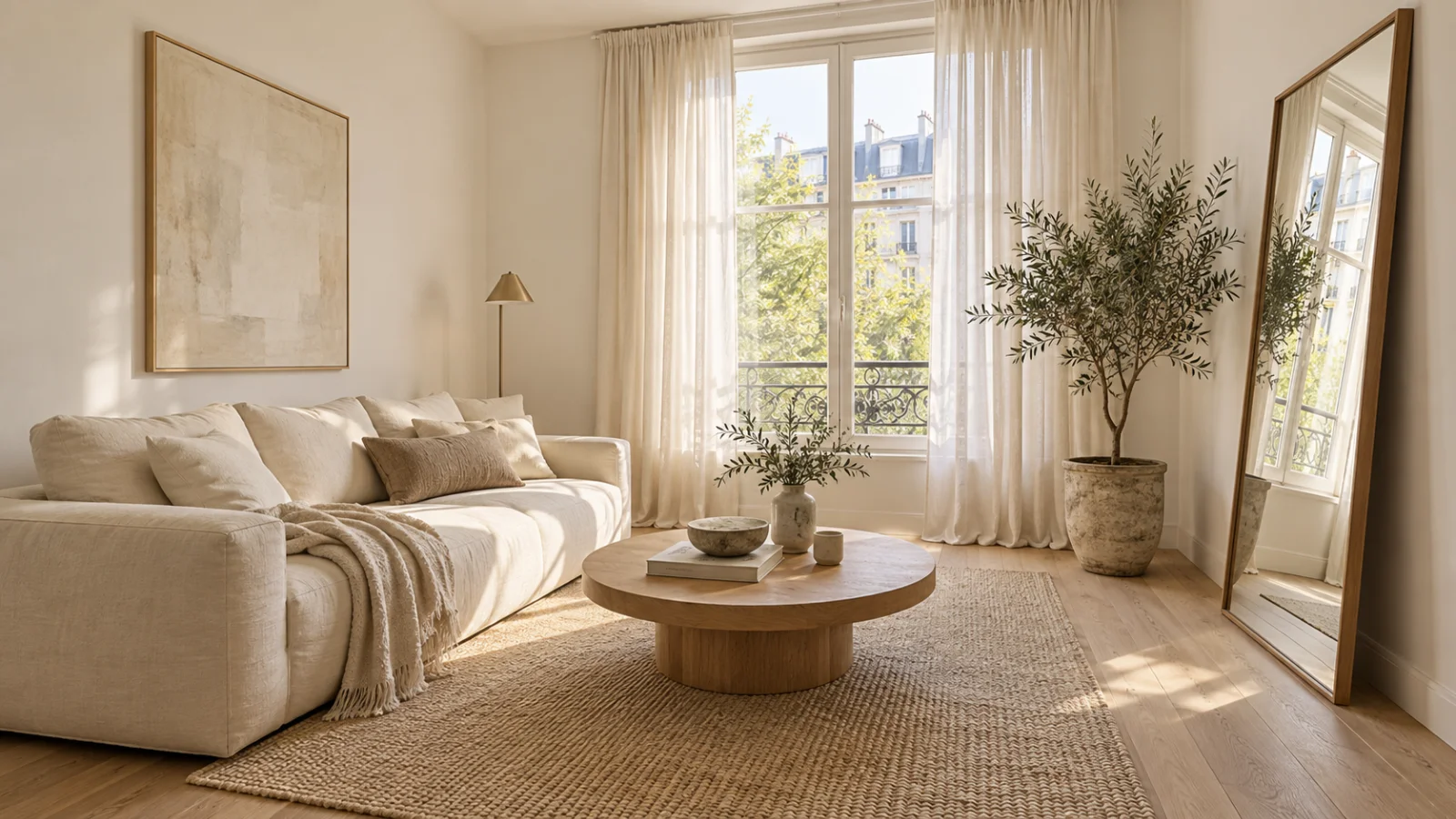
Warm white
Bright and airy without the clinical edge of brilliant white.
- Pair with: almost anything — oak, linen, brass, honed stone.
- Goes cheap when: it meets a brilliant white ceiling or sits around white plastic window frames. Next to them it looks dirty rather than warm.
Greige
Warmer than grey, calmer than beige. Hides scuffs and uneven plaster.
- Pair with: walnut, black metal, cream or charcoal upholstery.
- Goes cheap when: everything else in the room is greige too. It needs one dark thing — a lamp base, a frame, a wooden table — or the room goes flat.
Sage green
Brings nature in without being loud.
- Pair with: oak, linen, brass, terracotta pots.
- Goes cheap when: it tips into mint. If it already looks clearly green on the chip, it will look minty on four walls; choose the greyer one.
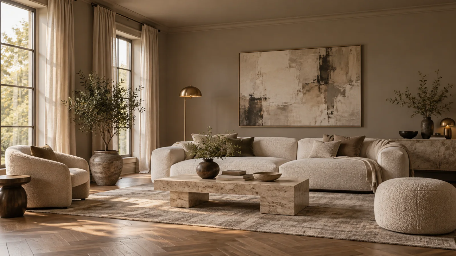
Mushroom taupe
Cosy, enveloping, and it looks custom — the colour on the walls and ceiling in the photo above. Makes cream and white furniture stand out.
- Pair with: cream boucle, travertine, brass, dark wood.
- Goes cheap when: the room is dim and lit by cold bulbs. It slides from mushroom to mud. Warm lamps keep it soft.
Deep navy
Adds depth without making a room feel dark, and makes brass and wood glow. Best in studies, dining rooms and bedrooms.
- Pair with: brass, walnut, white marble, rust or ochre textiles.
- Goes cheap when: it is a bright royal blue rather than one that is nearly black, or when white trim chops it into panels. Navy needs the woodwork painted with it more than any other colour on this list.
Judge it next to the sofa, not on the card
A colour card shows the paint against white. Your wall will be seen against the floor, the sofa and whatever light comes in, and that is where a colour turns out expensive or flat. A greige that looks perfect on the card can turn pinkish next to one floor and greenish next to another, and the light changes it again by evening.
So test the shortlist in the room, not at the counter. Take one photo that has the floor, the biggest piece of furniture and a window in it, and try the two colours you are torn between on that photo — first with the woodwork in the wall colour, then with it a shade lighter. The version that makes the sofa look better is usually the right one.
Stop imagining it. Look at it.
One photo of your house, and Exterior Snap AI shows you the finished result in about ten seconds.