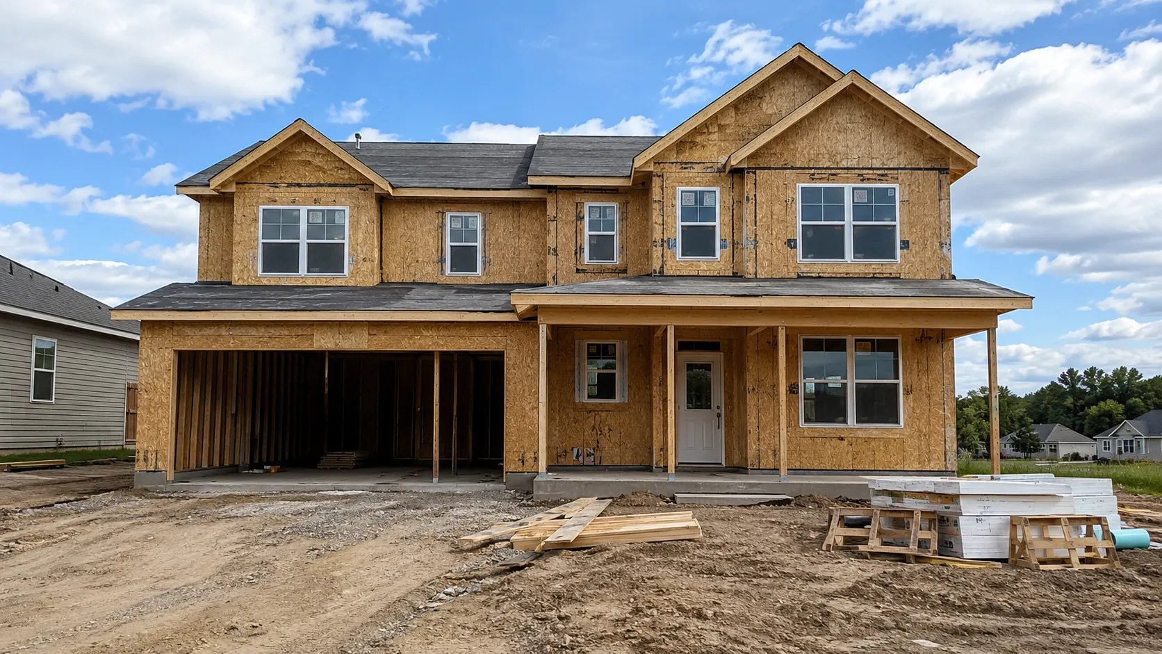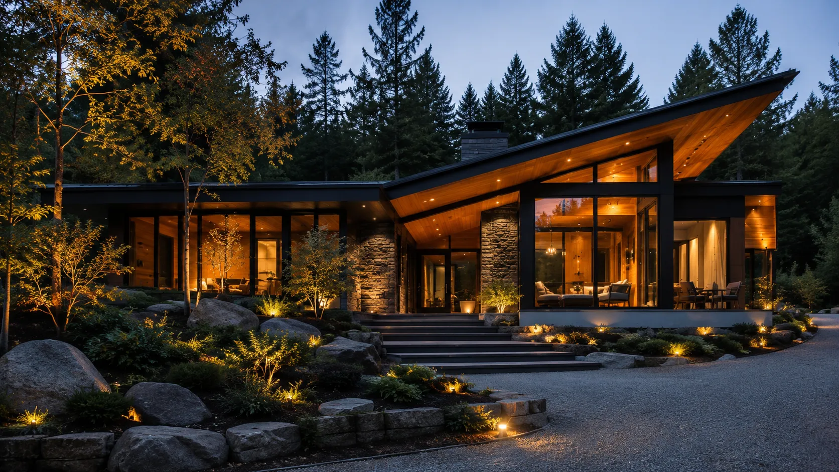
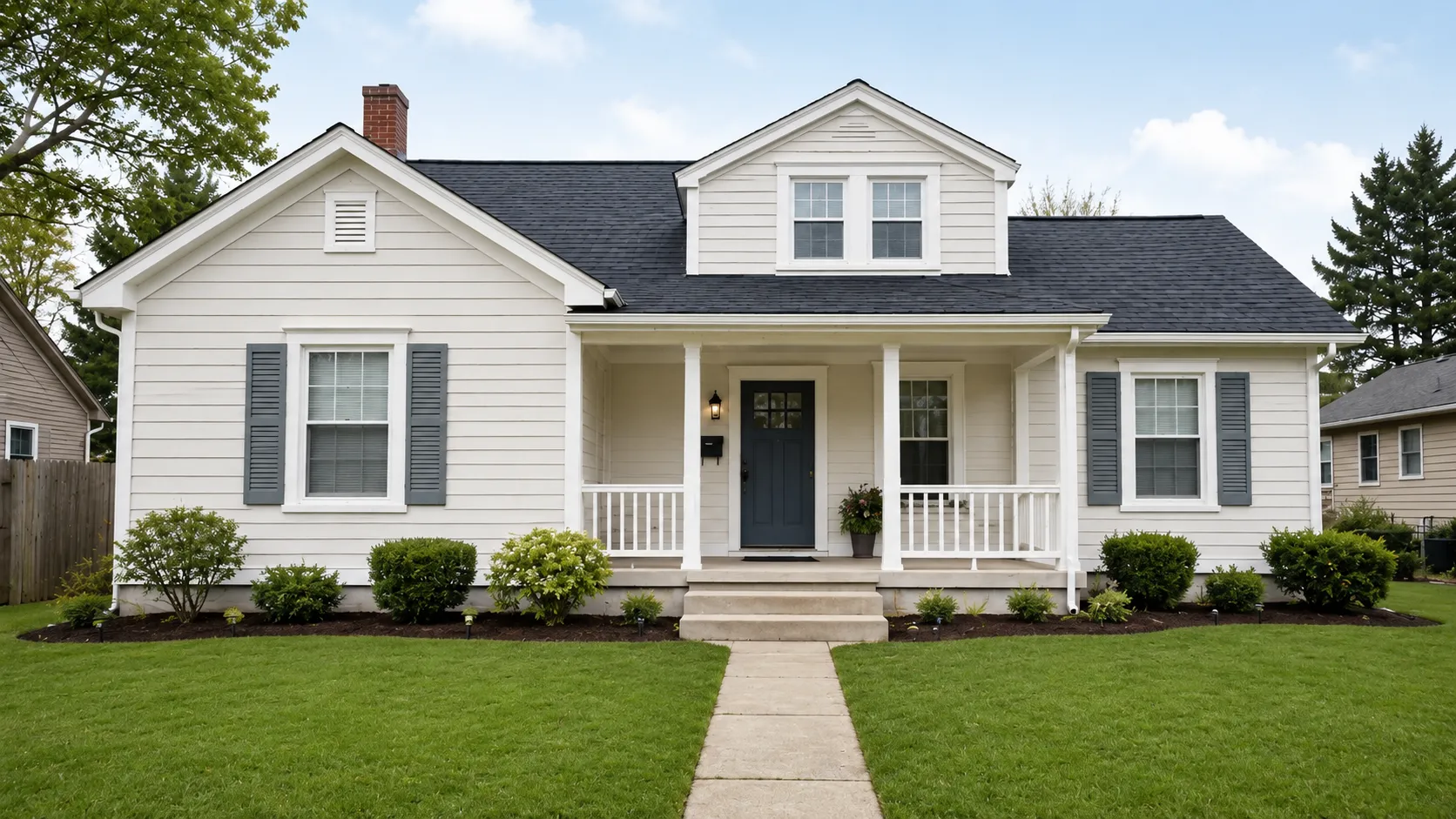
Everyone who has painted a house knows the feeling. You spent an hour at the paint counter, held up chips, narrowed it down to three, picked one you were happy about — and then the first wall went up and it was wrong. Too green. Too cold. Too much.
Nothing went wrong at the factory. The swatch was accurate. The problem is that a colour chip and a facade are two different objects, and the chip tells you almost nothing about the second one.
Scale changes saturation
A colour looks more intense the more of it there is. A grey-blue that reads as a calm, sophisticated neutral on a 5 cm chip becomes an assertive blue across a two-storey elevation. Designers deal with this by choosing a shade or two lighter and greyer than the one that looked right in the shop.
The rule of thumb: whatever you liked on the chip, the wall will be about one step louder.
Daylight is not neutral
The chip was lit by fluorescent or LED light indoors. Your house is lit by the sky — and the sky changes colour all day.
- North-facing walls get cool, indirect light. Warm colours go muddy, cool colours go cold.
- South-facing walls get strong direct sun. Everything washes out and goes lighter.
- Morning light is blue. Late afternoon light is orange. The same paint can look like two different products at 9am and 6pm.
Which is why you should never approve a colour from a single photograph taken at a single hour.
The roof is half the decision
This is the mistake that costs the most money. People choose the wall colour first and then discover it fights the roof they are not replacing.
The roof is typically 30–40% of what you see from the street. If the shingles are warm brown and you paint the siding a cool grey, the house will look unresolved no matter how good the grey is on its own. Pick the wall colour against the roof colour, not in isolation.
The same goes for anything else you are not changing: brick or stone veneer, a stamped concrete driveway, window frames.
Trim does more work than you think
Three colours is the standard exterior recipe:
- Field — the siding and walls, the largest area
- Trim — fascia, soffits, window frames, corner boards
- Accent — the front door, and sometimes shutters
Contrast between field and trim is what makes a facade read as designed rather than as painted. A dark field with crisp white trim reads sharp. A soft field with a barely-different trim reads quiet and expensive. A dark field with dark trim disappears — which is sometimes the point, and often an accident.
Test it properly
Three ways, in ascending order of cost:
Preview it digitally. Take one photo of the facade from the pavement and put the colour on the actual house, at actual scale, against your actual roof. This is what Exterior Snap AI does — it costs nothing and it removes 80% of the bad options in ten minutes.
Then paint a real sample. Once you are down to two or three candidates, get sample pots and paint a square metre — on the wall itself, not on a board propped against it. Look at it in the morning, at midday, and at dusk. Look at it from across the street, which is where people actually see your house from.
Then commit. By this point you have seen the colour at scale, in your own light, next to your own roof. That is as close to certainty as exterior paint gets.
The short version
- Go one step lighter and greyer than the chip you liked
- Choose against the roof, not in a vacuum
- Decide field, trim and accent together
- Never approve from one photo at one time of day
- Preview digitally first, then sample physically, then buy
Stop imagining it. Look at it.
One photo of your house, and Exterior Snap AI shows you the finished result in about ten seconds.