Exteriors fail in two directions. One colour everywhere and the house reads as a flat block with windows cut into it. Five colours and it reads as a house that changed its mind twice during the job.
The answer almost always is three.
Three colours, three jobs
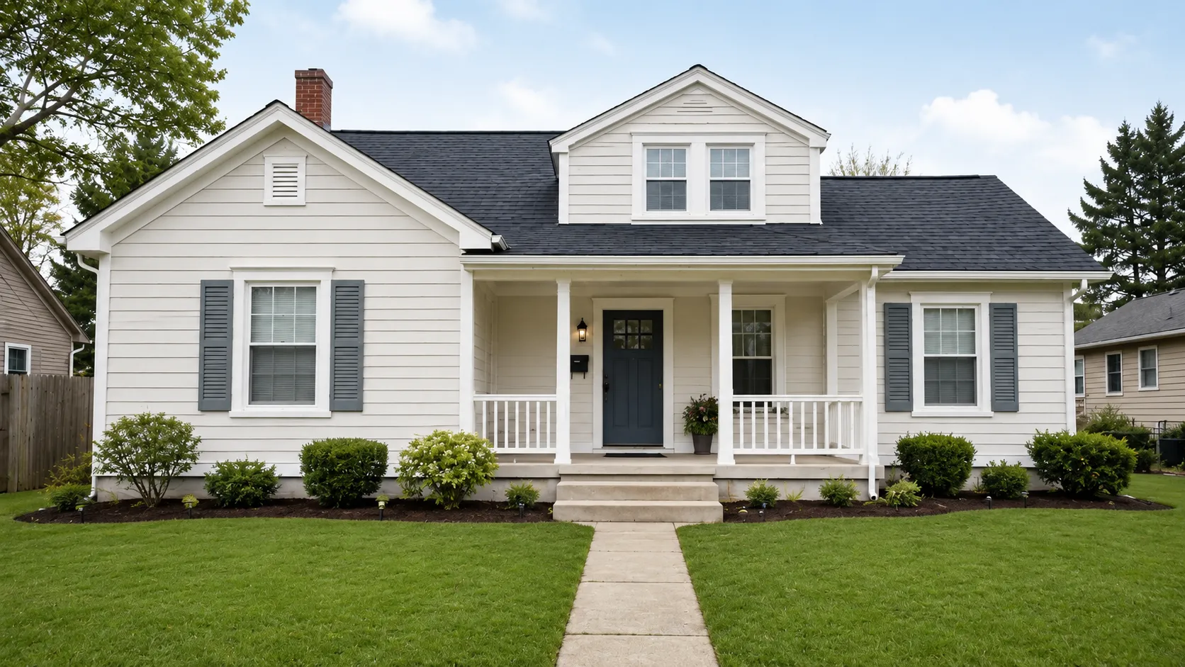
Field — about 70%. The walls. This is the colour people name when they describe your house. It should be the least interesting of the three, because it is doing the most work by area.
Trim — about 25%. Window frames, fascia, soffits, barge boards, corner boards, porch posts. Trim is what makes a facade look finished or unfinished, and it is the element most often left as whatever colour it came in.
Accent — about 5%. The front door, and sometimes shutters or a garage door. One accent. Two accents is not a bolder scheme, it is a weaker one, because neither gets to be the focal point.
The percentages are a sanity check, not a rule to measure. If the thing you are calling an accent covers a quarter of the facade, it is not an accent — it is a second field colour, and the house now needs a reason to have two.
Why three and not two
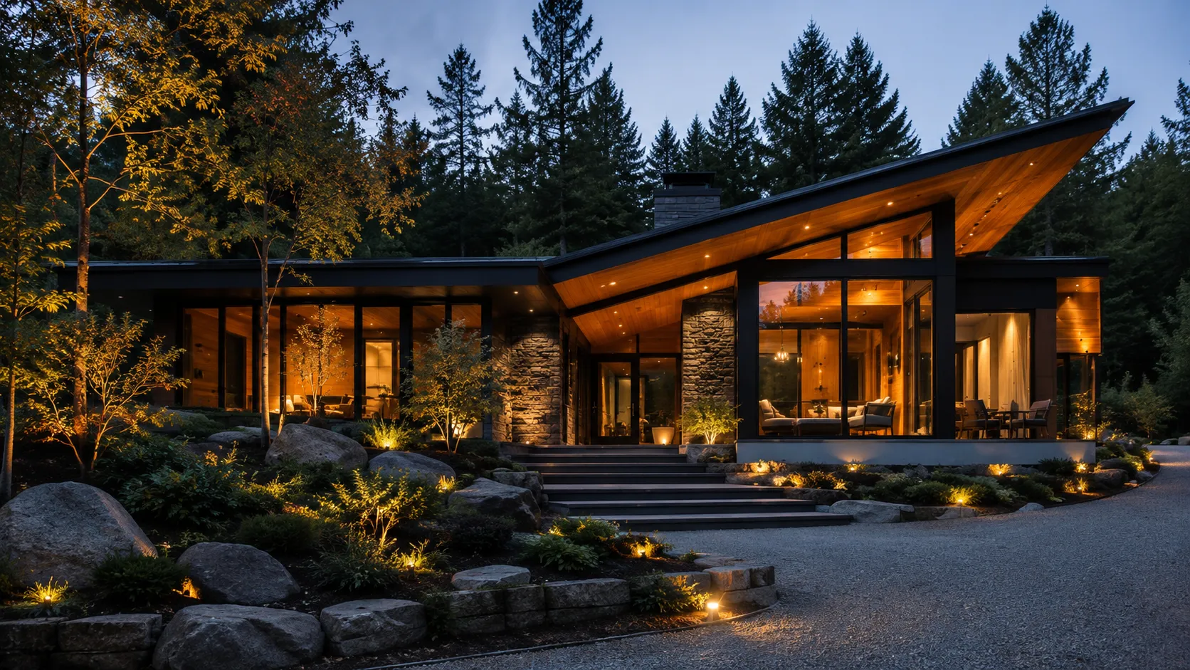
Two colours — walls and trim, no accent — is a legitimate scheme and reads as restrained and modern, particularly on a house with black window frames. It works when the architecture is the interest: a strong roofline, good proportions, interesting materials.
On an ordinary house, two colours tends to read as unfinished rather than minimal. The accent is what signals that someone made a decision.
Why three and not five
Every additional colour divides the facade further, and a divided facade looks smaller and busier. More importantly, each colour has to relate to every other colour. Three colours is three relationships. Five colours is ten. Nobody checks ten.
The houses that carry four or five colours successfully are almost always Victorian or Edwardian, where the architecture provides the frames — mouldings, string courses, bay returns — that give each colour an edge to stop at. On a flat render wall, there is nothing to stop at.
The order to choose them in
Not the order people use.
- Start with what is fixed. Roof, brick, stone, anything you are not changing. The roof should lead — it is the biggest surface you are not repainting and it sets the temperature of everything else.
- Choose the field colour against those fixed elements. This is the decision that constrains the other two, so it goes second and not last.
- Choose the trim as a relationship to the field — see below.
- Choose the accent last, when both of the other two are settled, using the logic in choosing a front door colour.
Working the other way round — falling for a door colour and trying to build a house around it — is how people end up repainting.
Trim is where most schemes quietly fail
The default is white, and white is often wrong.
Brilliant white trim against a warm cream wall looks like primer somebody forgot to finish. Against a mid-grey wall it produces a hard, cheap-looking line, because the contrast is higher than anything else on the house.
Three approaches that work:
Trim one or two steps lighter than the field, same base colour. The safest and quietest. The facade reads as one material with structure in it.
Trim much darker than the field — charcoal, black, deep bronze. Modern, graphic, and especially strong with black window frames. It outlines the openings rather than outlining the panels.
Warm white, not brilliant white. If you want white trim on a warm-toned house, choose a white with a yellow or red base. The difference is invisible on the card and obvious on the wall.
When the rule does not apply
Brick and stone houses. The brick is already the field, and it already contains three or four colours. You are choosing trim and accent only, against something you cannot change.
Mixed-material facades. Render below, timber cladding above, or stone to sill level. The materials are doing what colour normally does. Adding a full three-colour scheme on top produces visual noise — usually one colour for the rendered sections plus trim is enough.
Houses in a terrace or a conservation area. The row sets the field colour, whatever you think of it. Your decisions are trim and door.
Check the proportions before you buy anything
The failure mode of a three-colour scheme is not bad colours. It is good colours in the wrong ratio — trim that turns out to be 40% of the facade once you count the soffits, or an accent that disappears because the door is set back under a porch.
You cannot see the ratio on a colour card, because a colour card gives all three equal area. You can see it on a photograph of your own house with all three applied, which takes a few minutes and settles an argument that otherwise gets settled after the scaffolding goes up.
Stop imagining it. Look at it.
One photo of your house, and Exterior Snap AI shows you the finished result in about ten seconds.